Urlaubsreif
Project Context
The project involved developing a clear and recognisable visual identity for a podcast and vodcast series focused on tourism and science. The formats include one-on-one interviews, roundtables and short student episodes. The series is published on Spotify and other streaming platforms. The design was created as part of my work as a student assistant in the research project 4N at Jade University, where I contributed to communication and media-related tasks. The goal was to create a visual system that works across platforms and supports the tone of the project.
Client
Research project 4N, Jade University
Project Art
Logo design
Collaboration
Solo work within assistant role
Year
2023

Thumbnail with logo, used as podcast cover across streaming platforms
Logo Process
The logo was designed to be immediately recognisable as a podcast. The headphone outline signals the format at first glance. The central wave element stands for rhythm, sound and conversation, all core aspects of the project. The shapes were kept simple to ensure clarity and legibility across different sizes and contexts. Line weight and proportions were adjusted to keep the icon balanced and functional, whether used on signage, social media or in a small thumbnail.

Logo main version

Logo negative version
Typography
The word “urlaubsreif” (eng = ready for vacation) is set in Old Man Eloquent. The typeface was chosen at the request of the client, who wanted a handwritten look as part of the identity. Its flowing, slightly irregular lines bring a sense of movement and informality that fits the tone of the format.
The subtitle “#ScienceLab” is set in Armada, a typeface used by Jade University. Including it creates a quiet visual link to the academic background of the project.

Typography used in the logo: Old Man Eloquent and Armada Regular
Colors
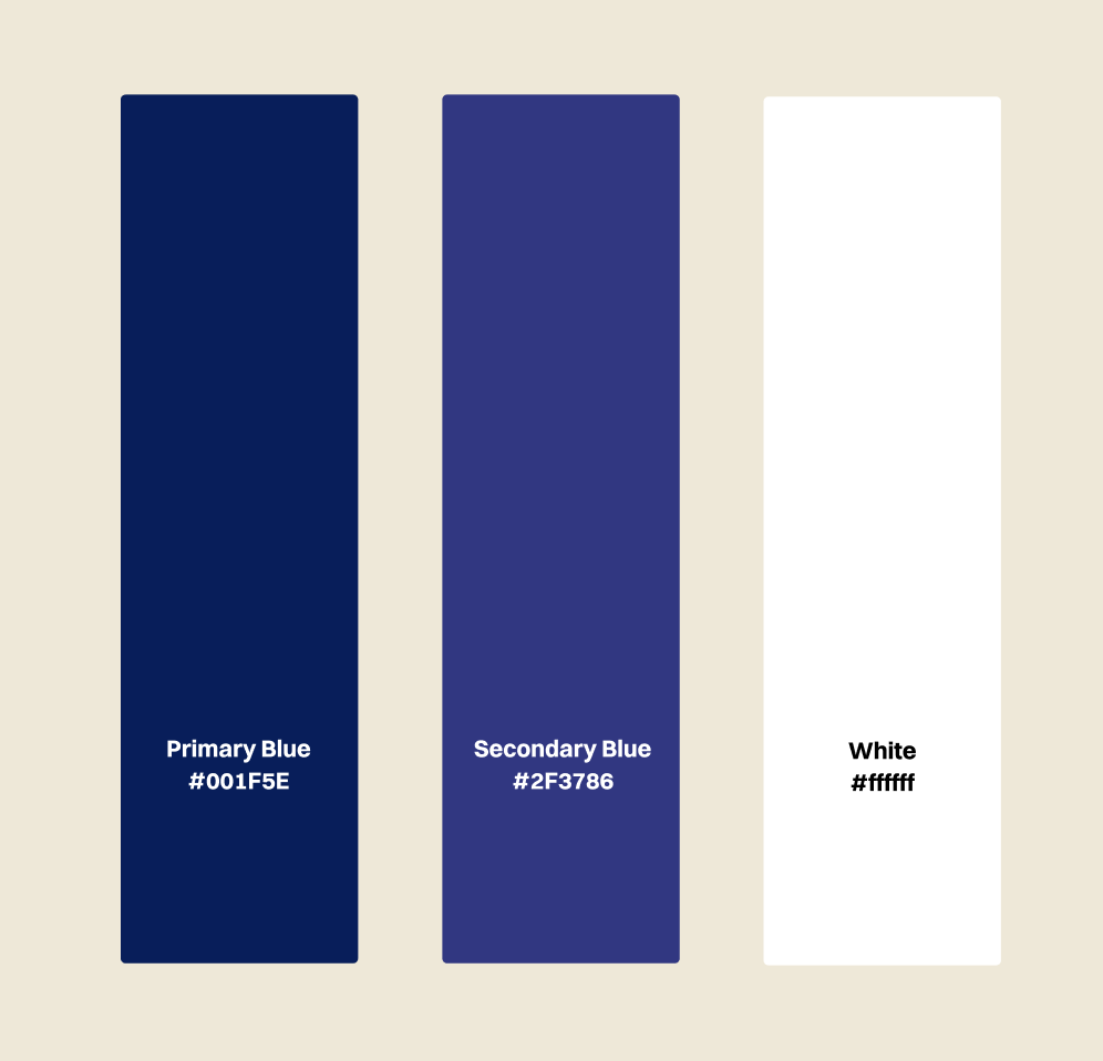
The identity uses a reduced palette of dark blue, secondary blue and white. The tones were chosen for their clarity and visual calm. Blue creates a sense of reliability and depth, which fits both the scientific context and the theme of dialogue. At the same time, the color scheme subtly refers to northern regions and maritime landscapes, making it a fitting choice for a project rooted in tourism and coastal topics.