
Paperglows
Project Context
This project was part of the Visual Communication 2 course. The task was to develop a corporate design for a fictional product or company on the topic „paper“ and apply it across various media formats. The focus was on concept development, visual identity, and consistent design across print, digital, and campaign elements.
We worked in small teams and used Adobe Creative Suite and Figma to create the designs. The project combined design thinking, layout work, and practical application.
Client
Academic project (Visual Communication 2)
Project Art
Corporate Design / Logo Design / Print Design
Collaboration
With Tove Paulsen and Neele Lahmeyer
Year
2023 / 2024
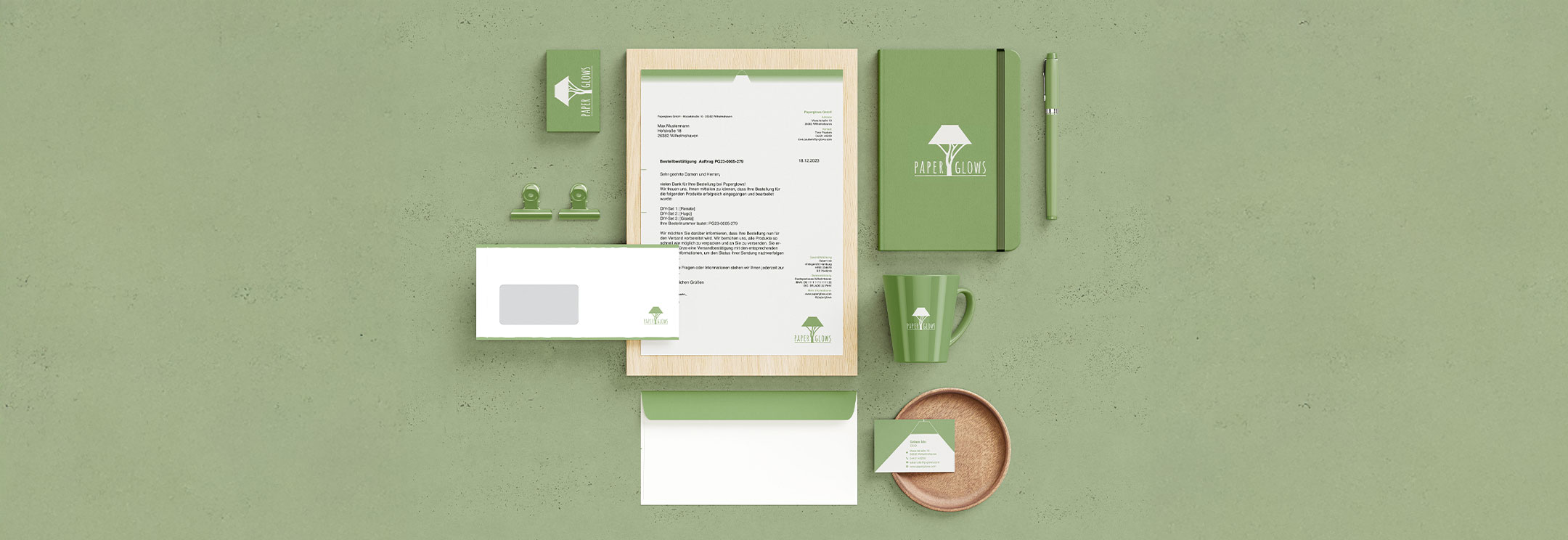
Visual overview of the identity system across stationery and objects
Project Description
Paperglows is a concept for a small start-up offering DIY kits for handmade lampshades. The lamps are made from recycled paper strips and are either pre-woven or available as a set for self-weaving. The idea behind the brand is to make something personal and sustainable. Instead of buying new, people can reuse
what they already have. The focus is on upcycling, individuality, and simple materials. The design system includes a logo, claim, business stationery, campaign visuals, and a responsive website. The main campaign was designed for Instagram, with additional assets like promo gifts and mockups.
Process
The starting point was the product idea: lamps made from recycled paper, available as finished pieces or DIY kits. We developed a name, created a logo, and built a consistent visual system around it. We worked with Illustrator and InDesign to define key elements like layout grids, color use, and typography. Every part was designed to function across formats, from print to digital. The campaign was created for Instagram, focusing on simple storytelling through posts and stories. A Corporate Design Manual documents all rules and applications to keep the system usable and clear.
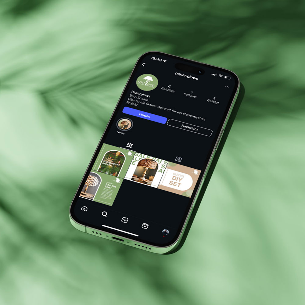
Instagram channel
Logo
The logo combines a minimal lamp shape with the name Paperglows set in Amatic SC. It was built using a custom grid. The mark appears in green or white depending on background and can be used on black, green, or brown surfaces. A protection zone and minimum size were defined. The claim “Bau dir eine.” when used, is always placed underneath the logo.

Logo main version
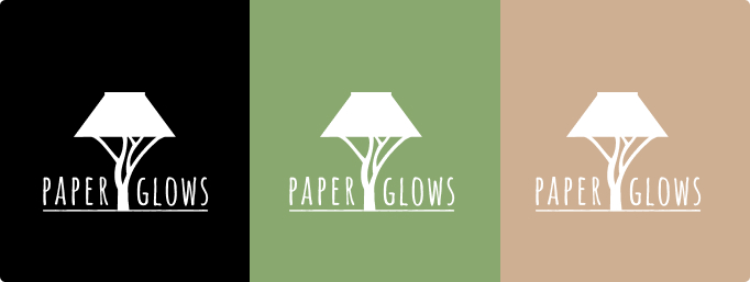
Logo negative version
Typography
The identity uses two fonts. Helvetica is used for body text, headlines and layout structure. Amatic SC is used in the logo and for individual elements like short lines or highlights. The contrast between the two supports clarity without making the design feel too strict.
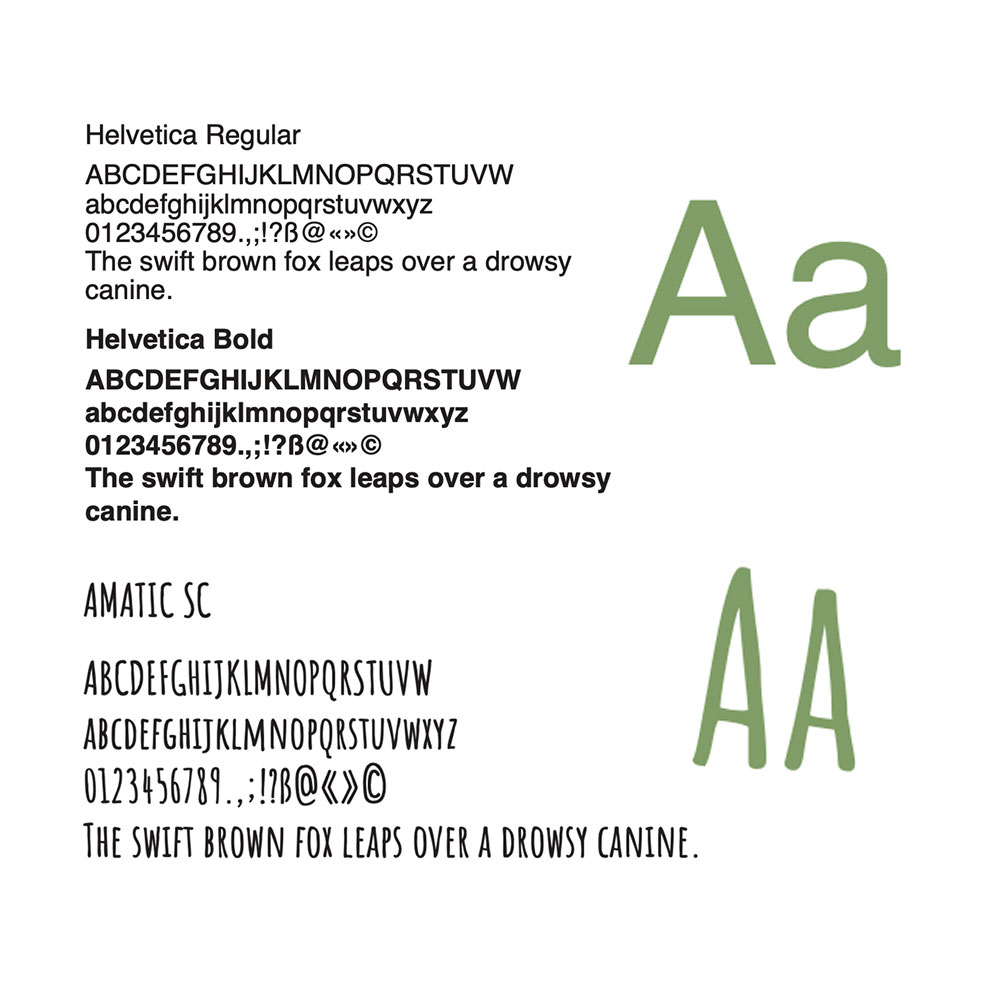
Used fonts
Colors
The color system is based on natural tones. Green and brown were taken directly from the product idea and material. Each base color is supported by four tints to allow flexibility. Black and white are used as secondary colors. The palette stays quiet and consistent across all applications.

Color palette
Documentation
You can go throgh the complete corporate design manual here