Fewohn.com
Project Context
Fewohn.com is a family-run business that rents out furnished apartments to working professionals in the region. I was commissioned to update their visual identity, including a new logo, business stationery and supporting elements for their website.
The client had an existing logo and a clear preference for blue tones. My task was to create a cleaner and more consistent look that works across print and digital platforms.
Client
Fewohn.com – Kirsten & Andreas Ahlschwede
Project Art
Logo design / Print design / Web design / Corporate Design
Collaboration
Solo (first client project)
Year
2021 / 2022
Logo mockup
Design Process

Previous logo version
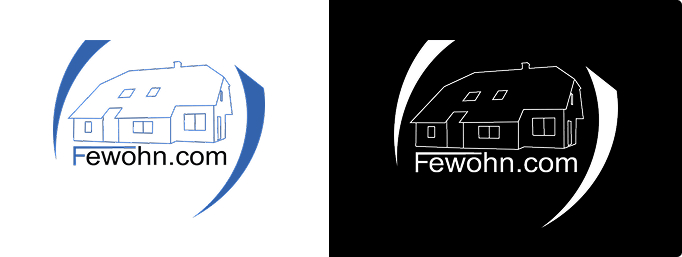
Redesigned logo with simplified house drawing
Colors
The color system is based on a deep, calm blue that reflects the coastal character of the region and supports the sense of reliability and clarity. It was developed in reference to the client’s location near Wilhelmshaven area shaped by water, sky and working life. For the upcoming website, a warm yellow-orange accent will be added to highlight interactive elements. The contrast adds warmth and draws attention without disrupting the calm tone of the overall identity. Black and white are used as functional neutrals for contrast and structure in both print and digital media.
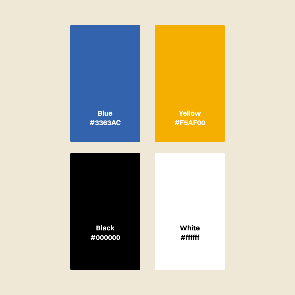
Color palette used across all formats
Print Materials
To support the updated visual identity, I designed a set of printed materials including a business card, a letterhead, receipts and small table signs for use in the apartments. All formats follow the same visual logic and use the brand color along with Arial, the typeface requested by the client.
The layout is reduced and functional, keeping the focus on clarity and easy readability. All files were prepared for print and digital use.
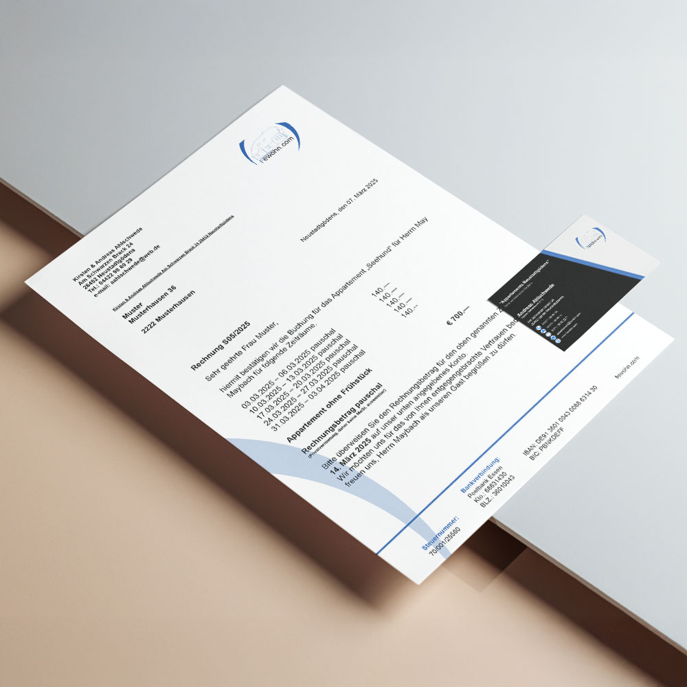
Business stationery: letterhead and business card using the updated brand system
Photography
For the website, I took a series of photographs in Wilhelmshaven and the surrounding region. A selection of images is used to support the visual concept and provide regional context.


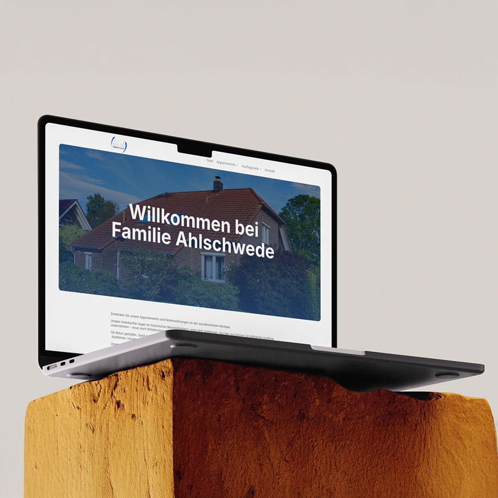
Website Preview
The website is currently in development. A first version of the homepage has been designed and will be implemented in the next project phase.