Enlightenment –
Awakening of Reason
Project Context
This project was part of the Typography and Layout course. The task was to design a printed brochure on the topic of awakening. The theme was open. Everyone could choose their own subject. The aim was to apply the basics of layout and typography. That included working with grids, text-image relationships, and using InDesign to build a full-format brochure. It was also about developing a concept and structuring content. Research, writing, and deciding what belongs on each page were part of the process.
Client
Academic project (Typography & Layout course)
Project Art
Print Design
Collaboration
Solo project
Year
2022
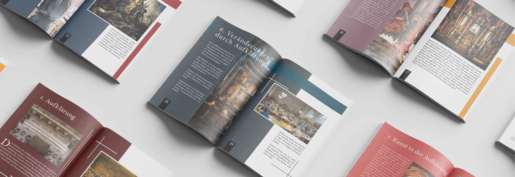
Mockup showing multiple spreads from the final brochure
Process
Typography
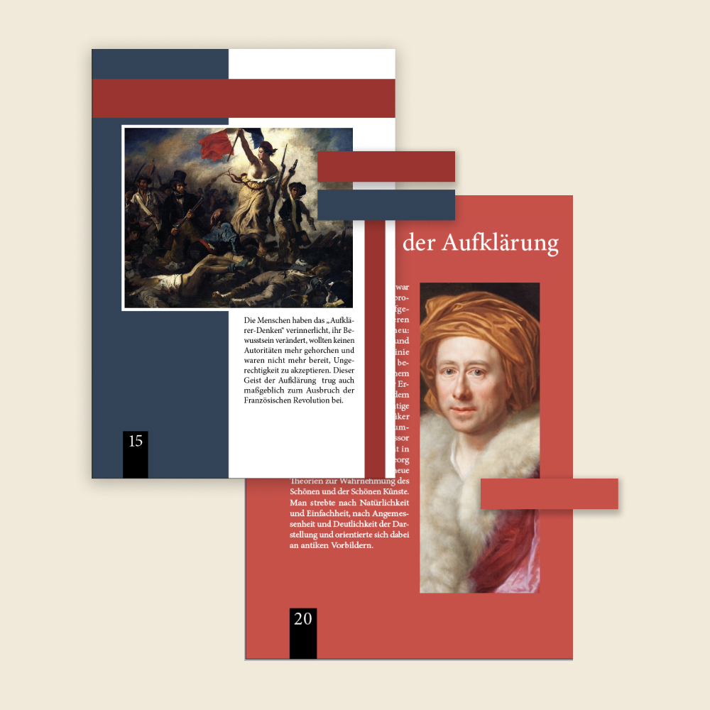
The main typeface used in the brochure is Adobe Hebrew. It was chosen for its clarity, compact proportions and neutral tone. It works well in both body text and titles, offering readability without drawing too much attention to itself.
The title on the opening pages appear in Times New Roman. That decision was intuitive and based on its association with traditional printed texts. Looking back, the typographic system could have been more consistent. Still, the overall balance between content and structure remained the focus throughout the design.

Typography excerpt showing the use of Times New Roman for the title and Adobe Hebrew for body text and headings
Color & Layout