Plato’s Allegory of the Cave:
The Shadows of Our Time
Project Context
This project is my bachelor thesis in the Media Economics and Journalism program at Jade University. The starting point is Plato’s Allegory of the Cave and the question of how this idea relates to today’s media environment. Platforms and algorithms increasingly shape which information becomes visible and which does not. As a result, people often move inside limited information spaces.
The project combines this theoretical perspective with editorial design. The goal was not only to explain the allegory but to translate it into a visual experience.
Client
Bachelor thesis / Jade University
Project Art
Print Design
Collaboration
Solo project
Year
2026

Bachelor thesis book mockup showing the final cover design
Process
Visual Dramaturgy
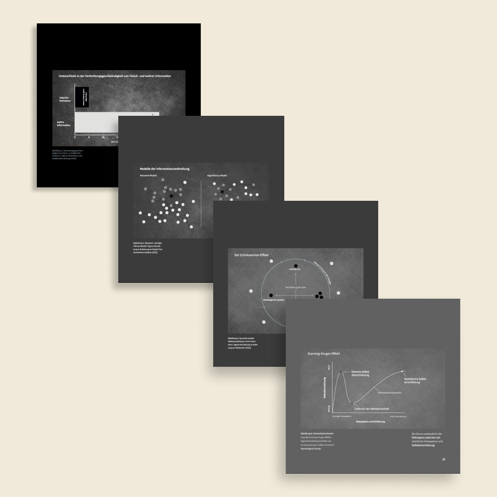
The visual dramaturgy is the central design principle of the book. The project follows the movement of Plato’s allegory. The reader begins inside the cave and gradually moves toward the light. This development is not only explained in the text but embedded in the visual structure of the book.
The early chapters are darker and visually compressed. Dark grey tones dominate the pages and create a dense atmosphere. The layout is tighter, white space is limited and typography appears more compact. This stage reflects the restricted perception inside the cave. As the reader progresses the visual structure slowly opens. Pages become brighter, white space increases and the layout becomes calmer and more balanced. Color, typography and layout therefore work together as a single system. The visual environment changes with the level of understanding and the reader moves step by step from a narrow and dark visual space toward a clearer and more open one.
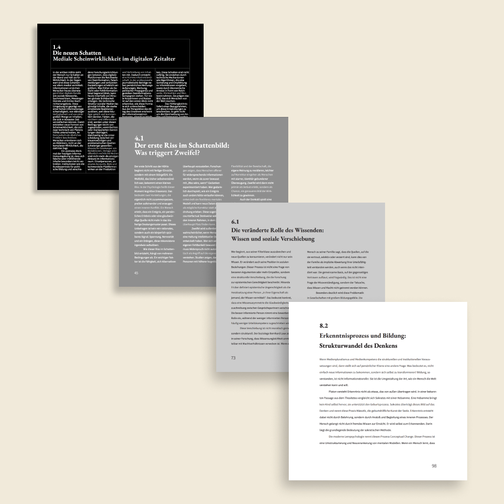
Layout progression across chapters
Visual Language